
Landing pages are a key part of any B2B website. It is often the first part of a startup’s website that is developed and put online. As a marketer, you know that your product or service is the foundation on which any buyer’s journey is built. So how can you ensure that your landing pages effectively convert prospects into customers? Below, we’ll tell you what landing pages are, why you need them, and how you can boost the conversion rate of these critical parts of your website.
In this post, we’ll look at:
- What is a landing page?
- Why you should create landing pages for your website
- 15 tips for creating an effective B2B landing page, with examples
- How to optimize your landing pages
- Tools to create landing pages
1. What is a landing page?
A landing page is a page on your website that is designed to convert those who visit it. That means it moves visitors from one stage of their buyer’s journey to the next, according to your needs and where it comes in that journey. Examples of “conversions” are the move from visitors to prospects, and from prospects to qualified leads.
In inbound marketing, landing pages are typically used at key points in the buyer’s journey to provide high-quality content in exchange for information from visitors.
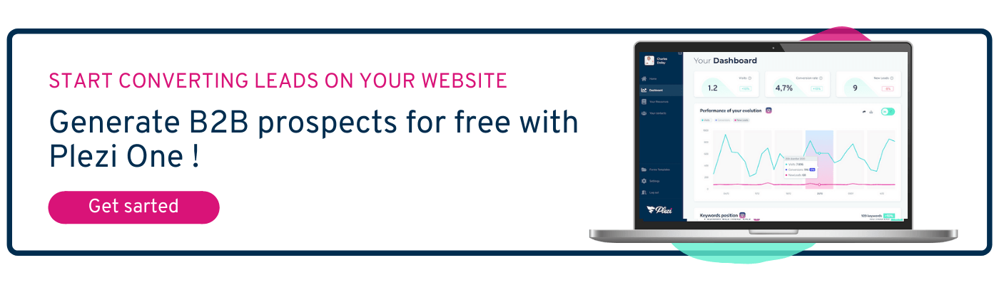
Using Plezi, it’s easy to create “drag & drop” landing pages. That means you don’t need to know how to code in order to maximize your conversion rates!
2. Why you should create landing pages for your website
Whatever your marketing strategy, the conversion rate of your website is probably one of your biggest areas of concern. This is where landing pages prove invaluable. Their main objective is to convert as much traffic to your website as possible.
A landing page should make a prospect want to take the suggested action, i.e., request a product demo, register for a webinar, download content, or create an account on your website. To ensure they do this, your landing pages need to be as clear as possible about the action to take.
To increase the conversion rate of your landing pages, you need to have a good understanding of your marketing funnel and make sure they get straight to the point.
You need to be able to present your offer to visitors in the most effective way possible based on their buyer’s journey. Do they need to be attracted? Convinced? Are they in the purchase stage? You need to be able to define each landing page by relevant content and where that content is in the buying journey so that it is clearly targeted – and once you have defined that it will be converted more easily.
You can see a good example of this on the Gocardless website, which does this very well. They are offering a guide to SaaS leaders about Churn, giving the reasons why, as well as reinforcing the quality of the content inside. It is clearly designed to attract their target market and can be a good high-quality piece of content for those people.
Below are also more calls to action encouraging people to find out more about Gocardless, while also including:
- the features and direct benefits of their solution;
- answers to legal and financial questions;
- freely available extracts of the code used.
3. 15 tips for creating an effective landing page, with examples
What best practices should you follow to create an optimized landing page that is (almost!) guaranteed to convert visitors?
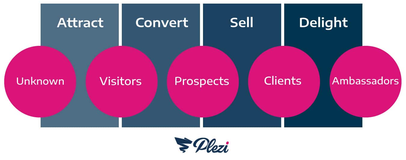
You should start by targeting landing pages to the four stages of your marketing funnel and ensure that the different parts of each page are based on the page’s position in the funnel. You should also monitor your conversion rate at each of these stages to get a better idea of where you are most effective and where there is room for improvement.
1. Ask yourself the right questions before getting started
Before you create a landing page, you need to have three bits of information:
- Objective: What is the objective of this landing page?
- Target: Who is the target audience? What stage of the buyer’s journey are they in? How ready are they to buy your product or service and what needs can you address?
Traffic source: The type and quantity of information you present on your landing page will change depending on whether a visitor arrives on the page from a social media ad, your blog, or after reading a series of emails in an email marketing campaign.
2. Start with the structure of your landing page
A landing page is divided into two main parts:
- Above the fold: content that is immediately visible to internet users before they scroll down
- Below the fold: content displayed once users start scrolling down the page
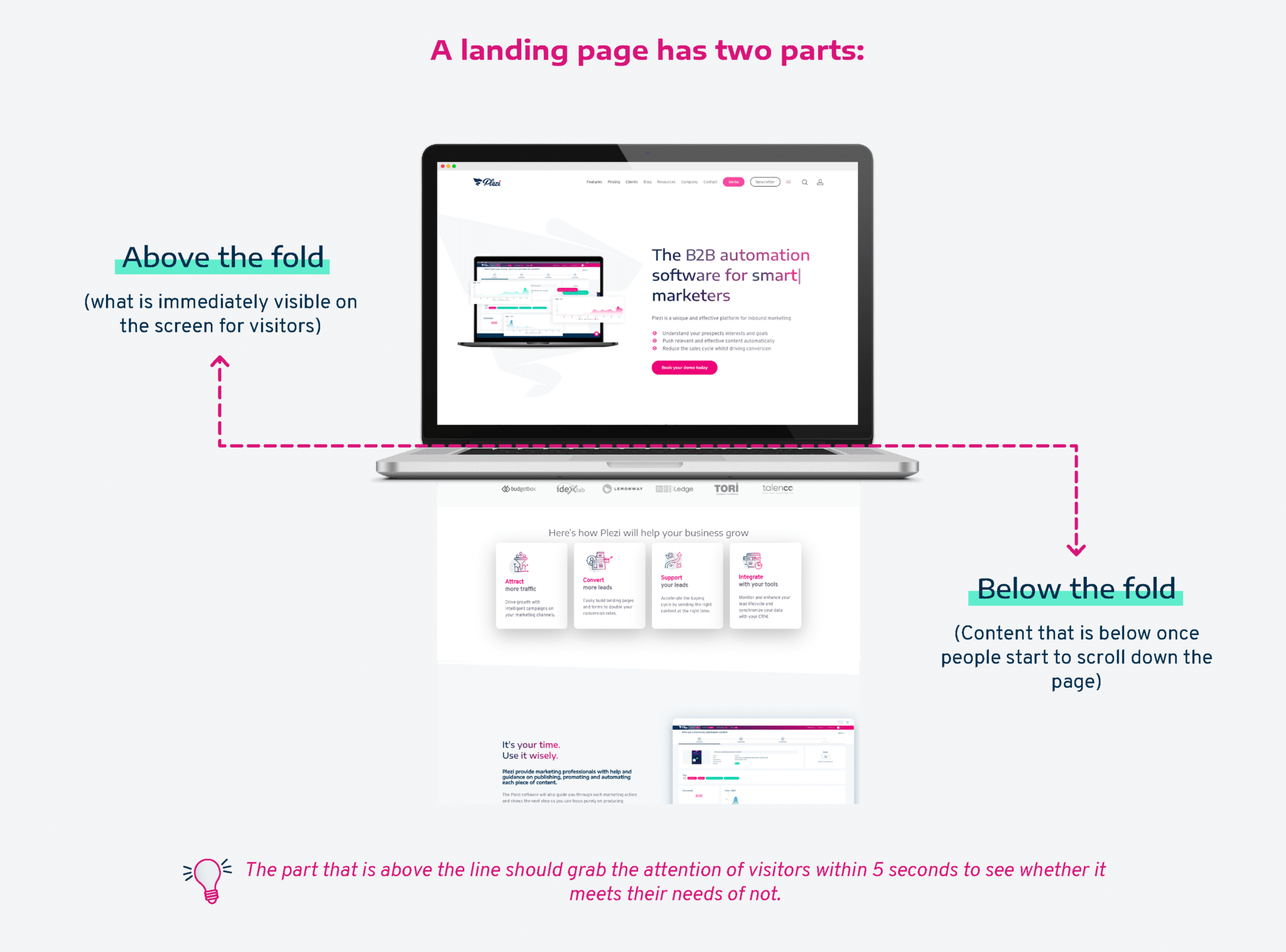
The content above the fold must quickly grab the attention of visitors. They need to be able to decide within 5 seconds if the page they are on will address their needs. The content below the fold should go into greater detail and support the value proposition presented above.
Once you’ve understood this, you can prioritize the different pieces of information that you want to highlight. To be effective, each section of your landing page should present one idea. Prioritizing the order in which information is presented will enable you to create a unifying thread from the top of your landing page to the bottom.
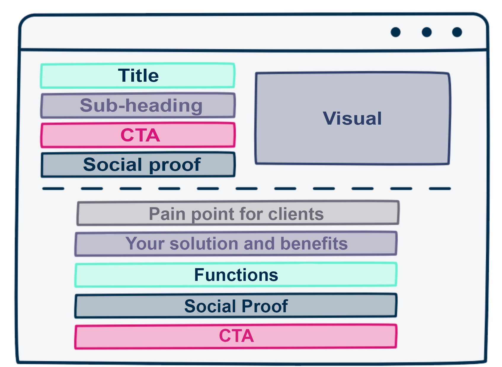
Example of prioritization: Your customers’ problem > Your solution > Its benefits > How it works > Your proof of how it works > Call to action (CTA)
Here’s an example of a basic landing page structure that has proven to be effective and which divides information above and below the fold:
3. Grab visitors’ attention with a powerful title
The title of your landing page should contain your key message.
Choose a short, catchy title. You should limit yourself to between 10 and 20 words to make sure that this is clear and concise.
Your aim here is to:
- quickly grab a visitor’s attention
- make them want to read more.
To do that, your key message should reflect your value proposition. Is a visitor hoping to find out more about your product or service? If so, you should be very clear about what your product or service does or what you are offering. Are they here because they clicked on a CTA to watch a webinar? Reassure them that they are in the right place and that tell them why it will be worth their while.
You can also reinforce the highlighted value.
You can use these three types of landing page title to help give you some ideas:
- Present a benefit: “Get more…”
- Remedy a missed opportunity: “Stop losing…”
- Ask a question: “Need to earn…?”
Use Michael Masterson’s 4U rule to see if your title is effective:
- Useful: What benefit does your offer provide?
- Unique: Why you?
- Ultra-specific: How can you promise this benefit? What evidence do you have?
- Urgent: Does your offer have a time limit? Specify it in your title.
Example:
Marketers, stop losing precious time..
Save a weeks worth of work with marketing automation from Plezi, the tool for busy marketers.
Don’t forget that writing for the web goes hand in hand with Search Engine Optimization (SEO). Remember to check that your landing page is optimized for SEO based on your main keywords. You should also think about your title tags (e.g., H1, H2, H3), meta description, and overall website structure.
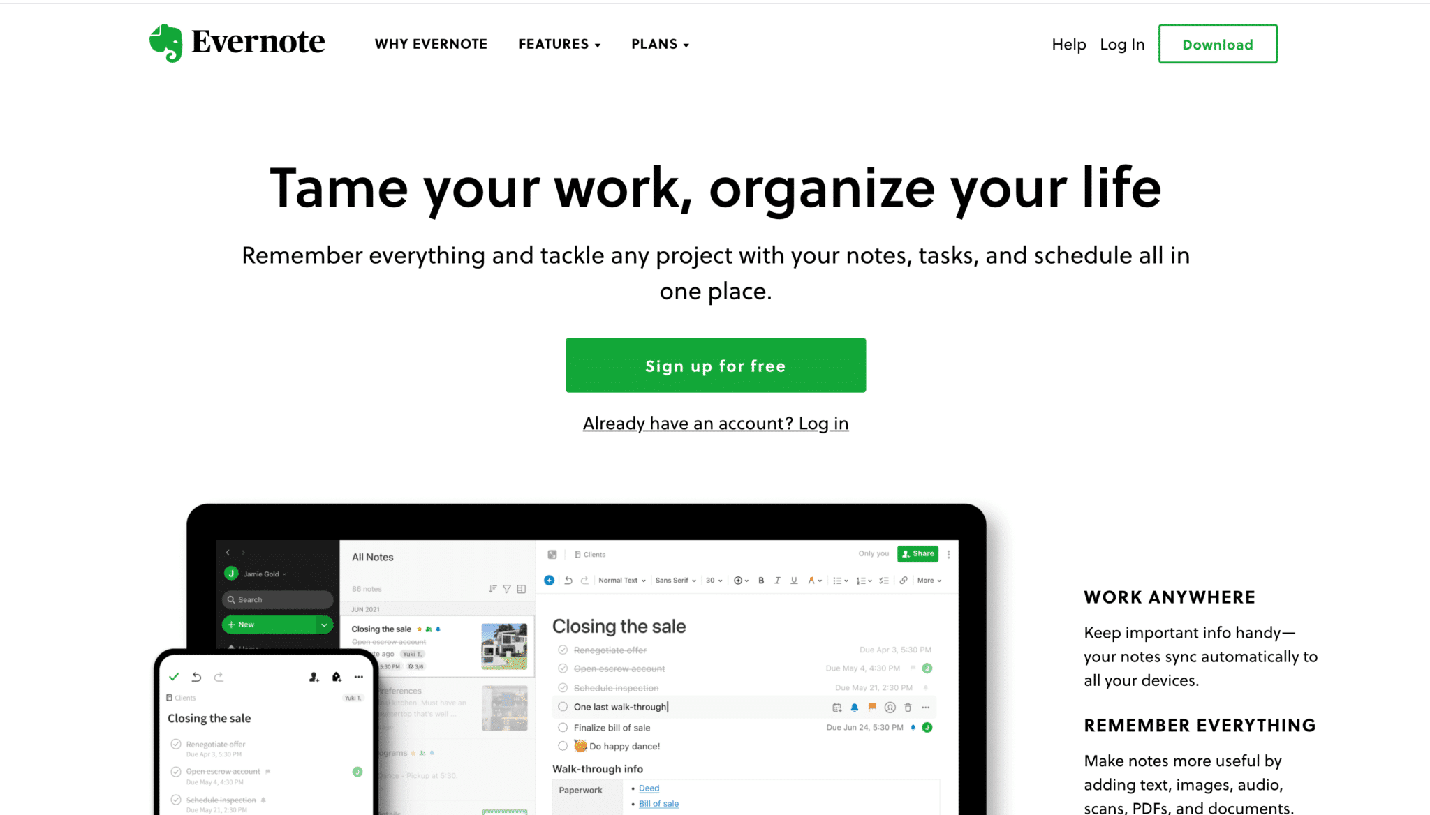
Evernote outlines the value proposition of their B2B offer to visitors in 2 short sentences and directs them to a free trial (the best way to convert visitors to a paid offer).
4. Include a compelling call to action
The calls to action on your landing page should be the most visible part of your page after the title. So, they must be well-positioned, visually appealing, and designed to grab a visitor’s attention.
Forget stock phrases that people no longer even stop to read, like “fill out the form” or “continue”. To reassure visitors and encourage them to click on a call to action, clearly explain what action visitors can take by doing so.
Likewise, try to use action verbs that suggest a minimum amount of effort to make the decision easier for visitors. For example ‘Get’ rather than ‘Download’, or ‘Sign-up’ rather than ‘Register’.
You can also reinforce your call to action by using a “click trigger” immediately below it. This is a small phrase that helps drive the point home and can sometimes be very useful in getting visitors to click on a CTA. On a webinar registration page, for example, your trigger can specify that if visitors are not available on the date of the event, they can still register to receive the replay.
Be careful to also place your initial CTA above the fold. If visitors have to scroll down a page to perform an action, your landing page is unlikely to convert as many of them as it otherwise could do.
A great example of this can be seen on Peakon’s Landing page, where all the information to download is above the fold, with clear indication of what is available in the guide:
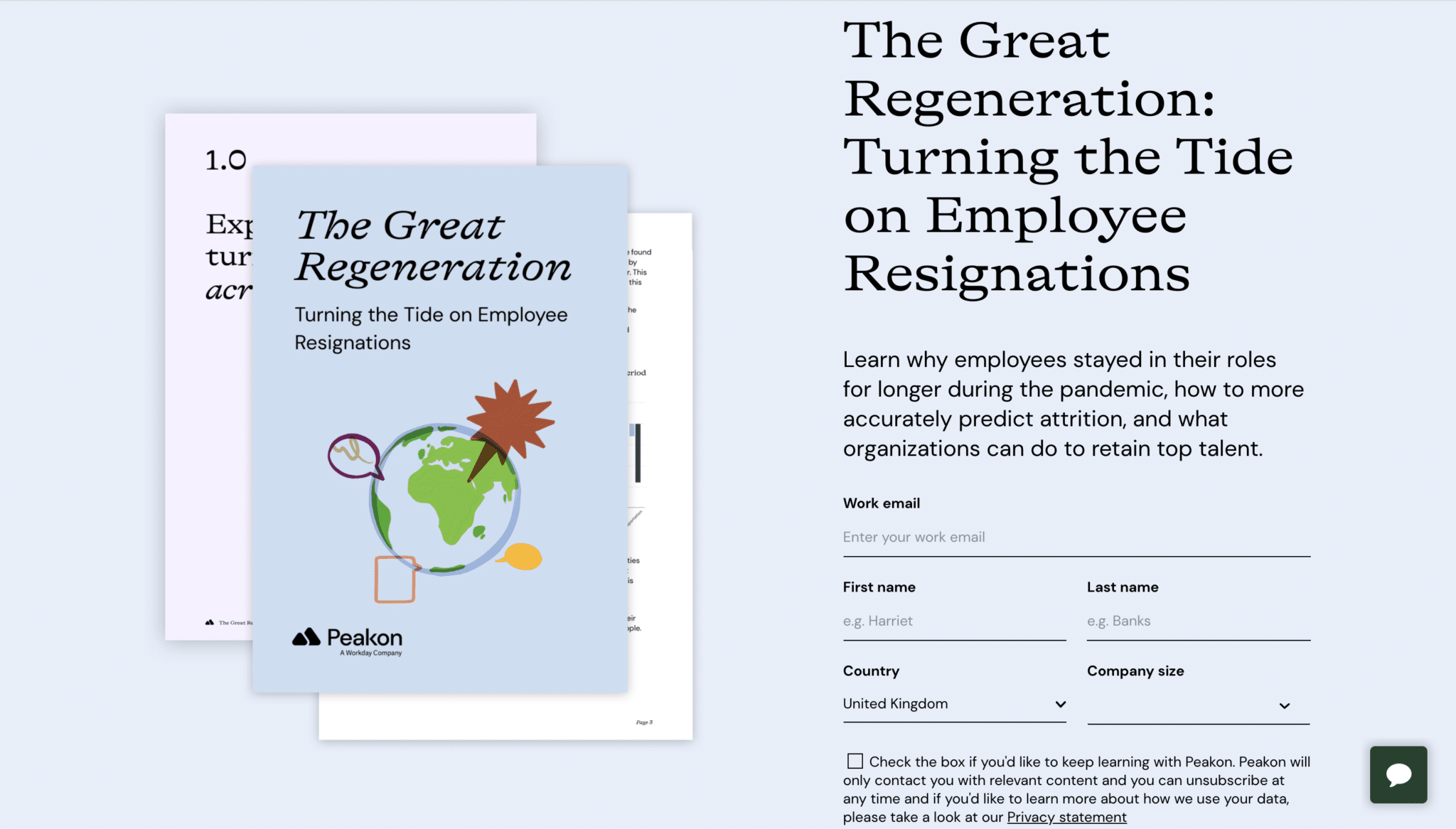
Below the fold, they again speak of their customer’s pain points, re-address what is in the guide, give social proof of their worth as a company and a CTA to find out more from them.
5. Include a relevant visual image
Every bit as important as the landing page text, the page’s visual appearance can have a significant effect on its ability to convert visitors. Here you can use:
- Images of your product or service in action. By showing your product or service in use, you help your target audience better understand what you are offering and how you can help them.
- Images featuring real people. Images of people on the landing page help create a connection and make it more likely that you will convert visitors (especially if these people are smiling!)
- Videos presenting your product or service. Video can be a powerful tool, letting you convert up to 4 times as many visitors to your landing page!
Again, don’t forget the two SEO components of images:
- include text for the image’s Alt tag
- compress the image as much as possible to decrease loading time.
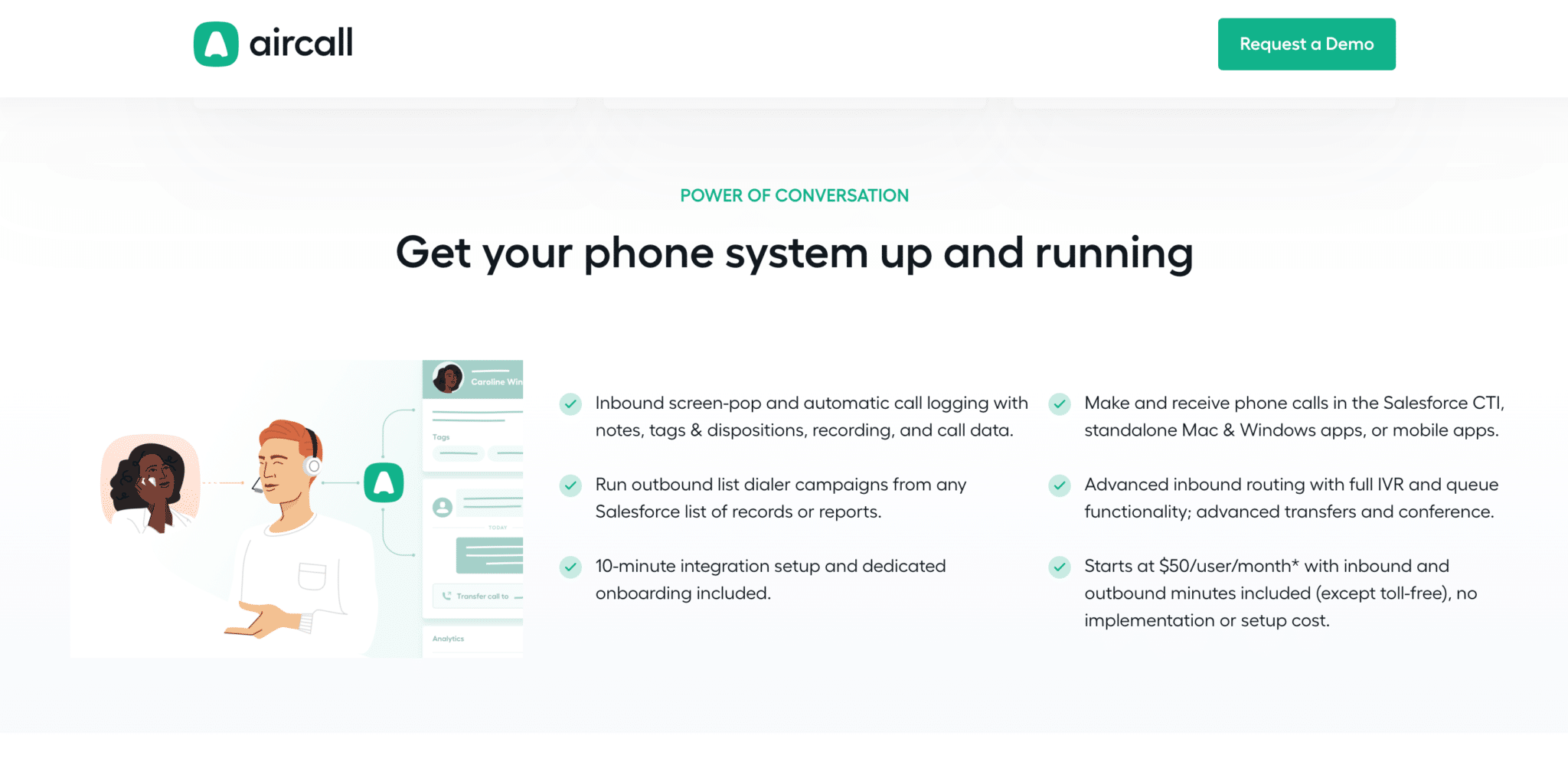
Aircall, a business calling solution, uses this visual aspect very well throughout their website:
6. Describe what problem you can solve for visitors
Now we can start to look at the content below the fold.
You should start by reminding visitors of the problem that your product or service can help solve.
In this section you can discuss why ignoring this problem represents a missed opportunity, and why other solutions to this problem are inadequate compared to yours. Obviously, when writing this content, you must be able to empathize with visitors and prospects.
This will enable you to address the obstacles they might encounter trying to solve this problem on their own or by choosing a competitor’s product or service.
7. Outline the key benefits
Your goal is to convince a visitor or prospect that taking the action suggested by your landing page will be worth their while. To do this, you need to address the specific problems they face. What do you know about their buyer persona and their needs at this stage of the marketing funnel?
You should be able to outline the benefits of your offer in a few well-chosen bullet points. If visitors have to read a lot of unnecessary information, you risk losing them before they take the action required. You should make sure that you only present the benefits/features/services directly related to the offer presented by your landing page.
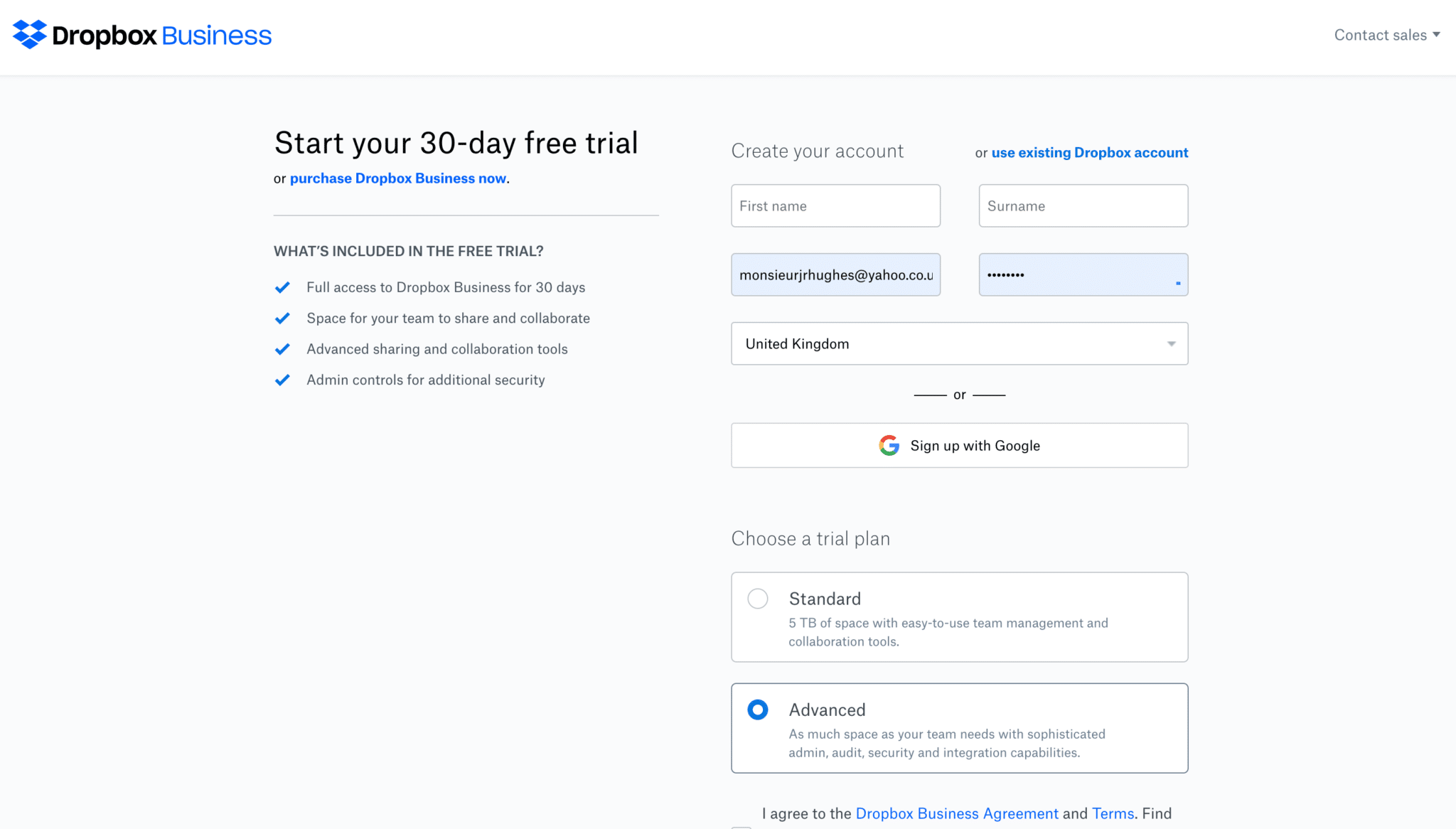
Dropbox business outlines the main benefits of its free trial offer and answers any questions visitors might have at this stage of their buyer’s journey.
8. Write for your customers
The golden rule of good landing page copy is to talk about the benefits of your offer or solution, not about its features.
As a guide, it’s a good idea to:
- Start by noting the feature involved
- Ask yourself “so what?”
- Describe the missed opportunity of not using this feature
Example:
- Plezi’s smart campaign helps move marketing leads closer to purchase.
- More leads are qualified by marketing and afterwards managed by salespeople.
- Companies report that, on average, around 80% of new leads never result in a sale.
Result:
Generate more customers with your marketing actions! 80% of your leads will never become customers if you don’t take the time to educate them. By automatically engaging prospects with Plezi’s Smart Campaign, you can shorten the sales cycle, educate and inspire them, until they become customers.
9. Highlight important figures
If you can, make use of figures to help convince visitors and support your message. The figures that you use will depend on the stage of the marketing funnel the landing page is designed to target. These might include things like customer satisfaction ratings or expected technical performance, for example.
Zendesk has a highly effective landing page for its Support Suite offer. Using an online tool, you can fill in information about your team and immediately see the performance improvements you could achieve with their solution, based on data from existing customers. It’s a great way to convert visitors!
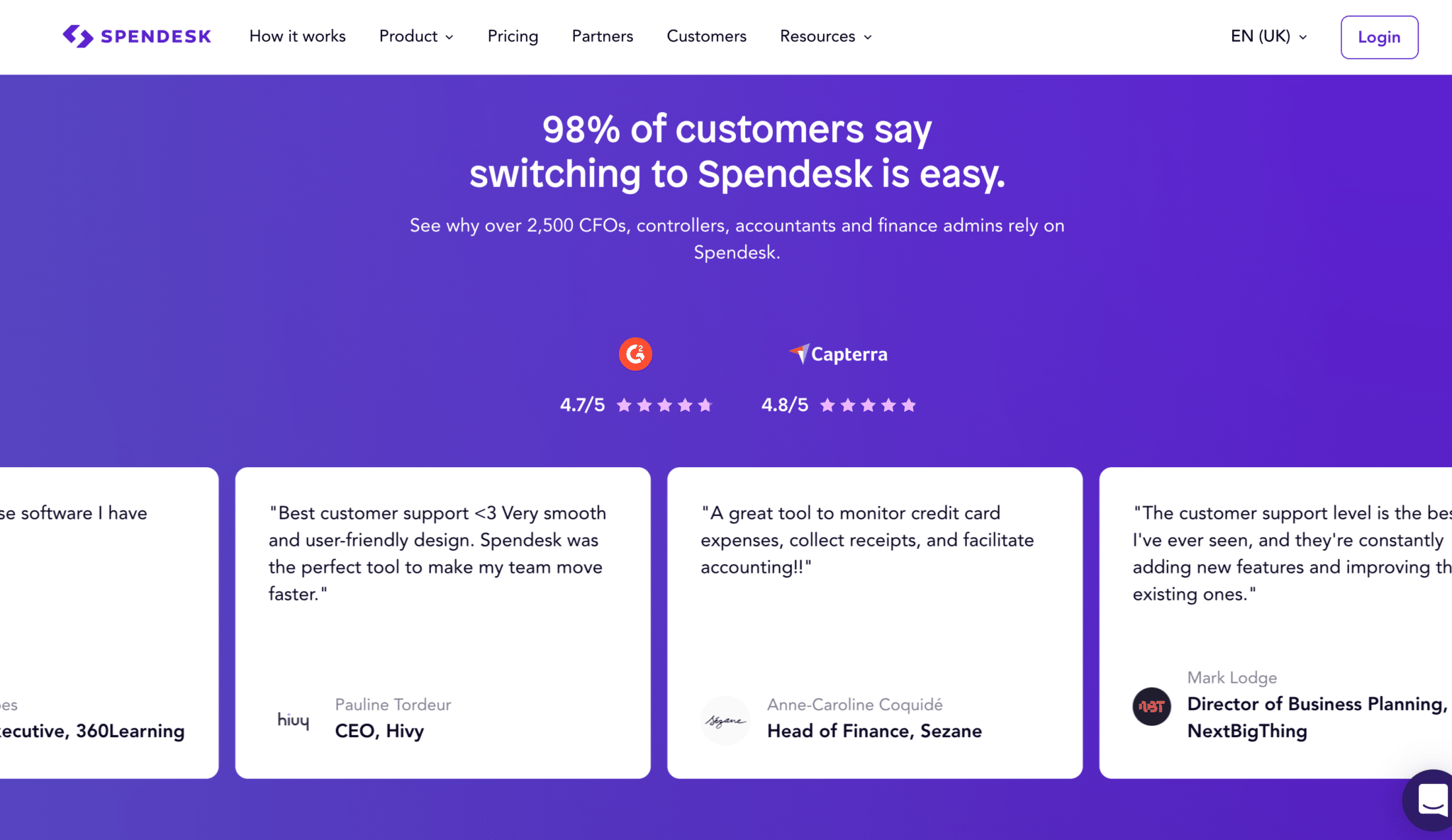
10. Reassure visitors with customer testimonials
Nothing works better to reassure and convince prospects than a quote from a customer who is satisfied with your product or service. These testimonials can take the form of written text, videos, company logos, or more in-depth customer case studies. These work especially well if the examples offered come from the same sector as your visitors.
You can use different approaches according to what stage of the buyer’s journey your landing page is targeting and its content. For example, you can add logos of existing customers to the end of a request for product demo form; add extracts from a customer case study to a page that targets a crucial step in the purchase stage; or include quotes from customers alongside flagship features like Spendesk does.
Landing pages are valuable tools to convert and support prospects throughout the buyer’s journey. By optimizing them and adapting them to the specific needs of your target audience, you can greatly improve the results of your marketing efforts.
In addition to figures and customer testimonials, social proof can take a number of other forms:
- Logos of existing customers
- Customer satisfaction ratings
- Numbers of customers
- Awards and certifications earned by your business
- App integrations and business partners
11. Answer your prospects’ questions in real-time
The key to good marketing is to answer the questions of prospects as thoroughly as possible. What if the best way to do this was to add a chat window to your landing page?
You can either use a discreet “here to help if needed” approach or engage visitors directly with automated on-screen messages. The advantage of this is that you can customize and automate everything.
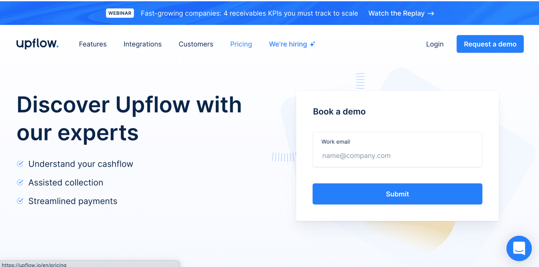
12. Include an appropriate online form
To maximize the number of visitors your landing page converts, you should only request the information you need based on where your offer sits within the sales cycle.
The best way to do this is to make use of smart form fields. These let you request more specific information from contacts you already know. This technique, called progressive profiling, enables you to collect an increasing amount of information about prospects without asking for the same information twice. In this way, the information that you have about a prospect increases as you interact with them.
It’s also important to make your form highly visible on the page. Ideally, it should be placed in a box with a contrasting background colour. This will help it stand out clearly from the rest of your landing page.
It should also be positioned in the right place on the page. While there’s no golden rule for this, short landing pages typically include the form above the fold, and longer pages include it at the bottom of the page. The most important thing is that it is positioned in the best place for your target audience. Ultimately, you’ll have to test how the page performs to know if this is the case.
Upflow, a cloud-based solution to manage customer invoices, only asks for your professional email address in their request for demo page. At this stage, there’s no need to ask for more information.
13. Remove navigation menus from your landing page
A landing page is designed to elicit a specific action, so it’s important to remove as many sources of potential distraction as possible.
This means removing the navigation menus that are usually found on other pages of your website. It’s common to leave your company logo at the top left of the page to enable a visitor to return to the homepage of your website.
You should also consider removing other potential distractions from your landing page, like popups or chatbots, if these are not directly relevant to the action requested by the page.
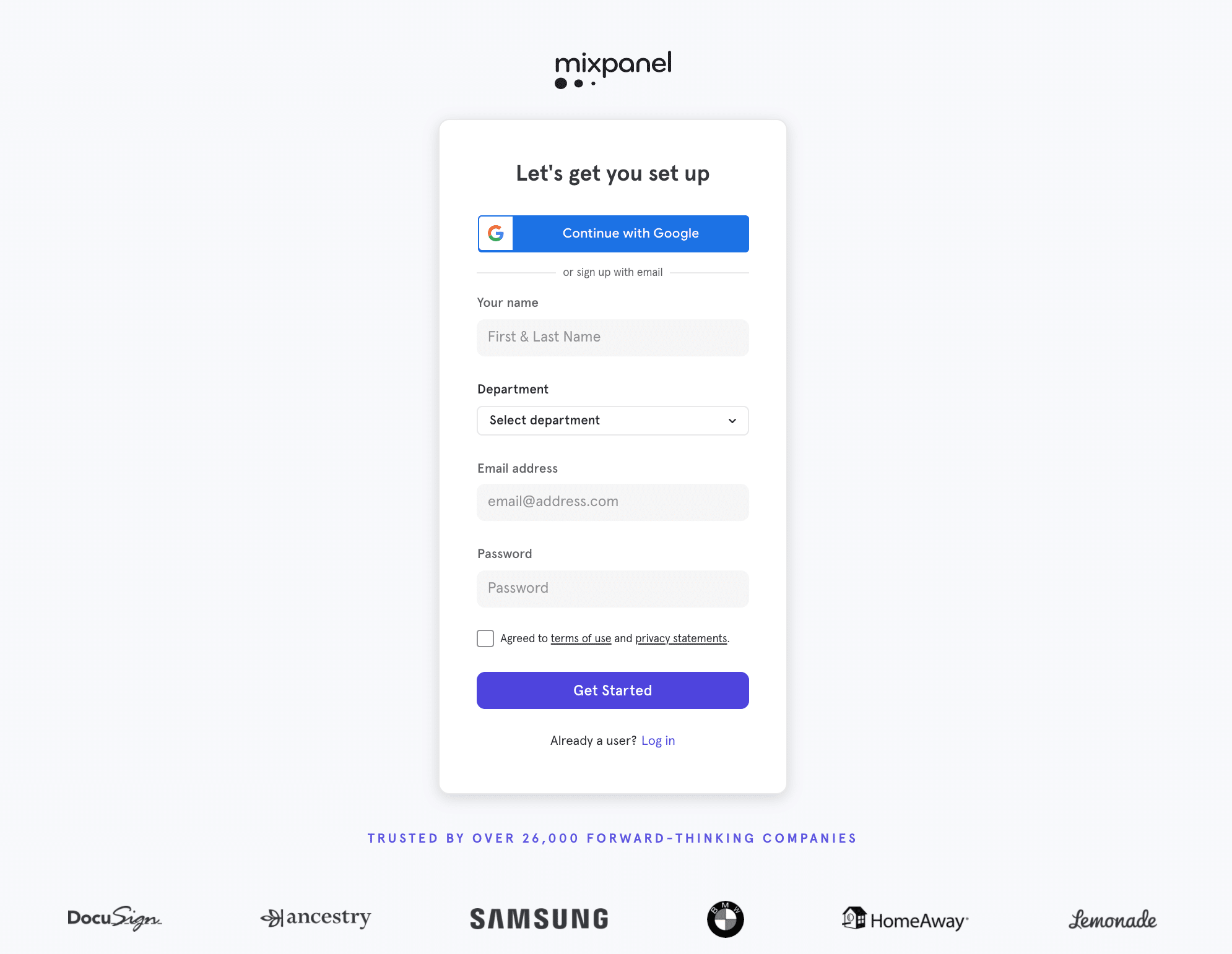
14. Optimize the UX design of your page
The UX design (also called the page layout) of a landing page should be visually appealing but not distracting. It should have a clean, uncluttered design to focus visitors’ attention on the essential parts of the page.
As mentioned above, this means that you should remove the navigation menu. You should also ensure that the important parts of the page are above the fold.
Mixpanel makes creating an account on their website a very straightforward experience. The landing page doesn’t have a navigation menu, includes a simple form, and has only some customer logos for social proof.
15. Carefully check your page before publishing
Have you created a Thank You page that visitors can be directed to after conversion? Has your automated follow-up email been set up correctly?
Check that the different actions that happen after conversion are functioning correctly and that they can be tracked. Also, make sure that the necessary tracking elements are integrated into the landing page (e.g., Google Analytics, Google Tag Manager, Facebook Pixel, or LinkedIn Insight tag).
You should also double-check your page URL. This should be as short as possible.
Before publishing your landing page, ask a colleague to judge how effective it is in less than 5 seconds. Visitors should be able to determine what action they are required to take within seconds of your landing page loading. If not, you need to make sure that this is clearer.
4. How to optimize your landing pages
Of course, you don’t just stop working on your landing pages once they’re published. If you want to optimize their conversion rates, you’ll need to monitor their performance and adjust pages accordingly.
Start by analysing the current conversion rates of your landing pages. The conversion rate is one of the best indicators of how well your website is working. If you skip this step, you’ll have a hard time understanding why your campaigns aren’t delivering the results they should.
At Plezi, we’ve found that good landing pages – and more generally pages designed to convert visitors – should have a minimum conversion rate of 10%.
If not, you need to look at where and how your landing pages are failing to deliver.
To track their performance, use A/B testing to test landing pages with slightly different text, images, layouts, or CTAs. You can also integrate website heatmaps, like Hotjar or Microsoft Clarity, to better understand users’ behaviour on the page.
Also remember to put UTM codes in page URLs to be able to analyse the performance of your campaigns and your traffic sources. The data these provide will be invaluable for optimizing your landing pages.
Sometimes, however, the problem doesn’t lie directly with your landing page, but stems from a lack of coherence in your buyer’s journey.
Ask yourself how visitors arrive on the page. What have they been promised? Are you really addressing their needs? By thinking about the buyer’s journey as a whole, you’ll be better able to offer prospects an enjoyable, engaging experience, from the initial catchy landing page title to the thank you page.
5. Tools to create landing pages
There are two main types of tools available for creating and managing B2B website landing pages.
Specialist landing page platforms
These tools specialize in the creation of landing pages, and generally work using drag & drop. They provide users with different landing page templates, ready-to-use modules, and online forms which you can drag and drop onto your landing page. This makes it easy to create a landing page without having to write a line of code, such as Unbounce or Instapage.
Marketing automation tools
That’s us! Marketing automation tools, like Plezi, usually come with a dedicated landing page editor. Our editor works using the same drag & drop principle as the specialized platforms to make it easy to create landing pages.
The advantage of using marketing automation software is that the leads generated by your pages can be then directly integrated into your marketing ecosystem. This makes it easier to nurture them, qualify them, and pass them on to the sales team.
Here’s a few things to remember when deciding on which tool to choose:
- Ease of use: landing pages are often the responsibility of marketing managers who don’t have skills in web development. So, it’s essential that the tool you choose lets you easily create the landing pages you want.
- Integration into your ecosystem: because the primary objective of your landing pages is to generate leads, you need to ensure that these aren’t lost by the tool you use to create these pages. Instead, they need to be able to be easily integrated into your normal workflows.
- Price: Obviously price is always an important factor. The right price will depend on things like your strategy and the number of landing pages you need.
Landing pages are a valuable part of your B2B website. Creating highly effective landing pages is almost an art in its own right. But with time and practice, you will only get better at doing so.
And it’s important to take the time to get them right, because they are key to the success of your inbound marketing strategy.