Webinars are a B2B content format that can no hardly be ignored. Successive lockdowns and the huge increase in the number of dedicated webinar platforms (like our very own Saloon) that have appeared as a result have made that abundantly clear. So, while everyone is starting up their own version of a B2B webinar, where do you start to make sure that it will bring you interesting sign-ups.
At Plezi, we’ve been doing webinars for several years now, and we think they’re great! Firstly, they’re a great way to nurture our prospects and answer their questions, and their conversion rates continue to improve. But you’ll probably have to try out different ideas and make some adjustments before you find the magic formula for webinars.

We wanted to let you benefit from the mistakes we’ve made and what we’ve learnt about webinars. So we’ve planned a series of articles that bring together both practical advice and things that we’ve tested ourselves to help you make the best use of this exciting new content format.
In this article, we’ll look at webinar landing pages. Your aim in creating these is to convert as many prospects as possible. But how can you get your message across effectively and make people want to register for your webinar? How can you make sure that prospects have all the information they need? To find out more, just read our guide.
In this article, we’ll look at:
- Why web usability principles are just a guide
- The best way to create landing pages that really convert
- A to-do list for creating a landing page in just a few minutes
1. Web usability principles are just a guide
Writing content designed to convert prospects is never that easy. With the huge amount of information available online on how to do just that, it’s sometimes hard to know where to start.
There are a range of different web usability principles available online which can serve as a great starting point for creating a landing page and which will help you avoid making any major design mistakes. Some principles have become benchmarks, like the “F pattern” which has had a lasting effect on how we design web content. A number of research centres, like the Nielsen Norman Group, are both pioneers and leaders in this field.
However, not all web usability principles should be followed to the letter. The most important thing is to create a web page that addresses the needs of your prospects.
The two keys to creating a successful landing page are listening to your prospects and customers and testing your landing pages to make them better. So, don’t be afraid to ignore some web usability principles that are too strict if users respond favourably as a result.
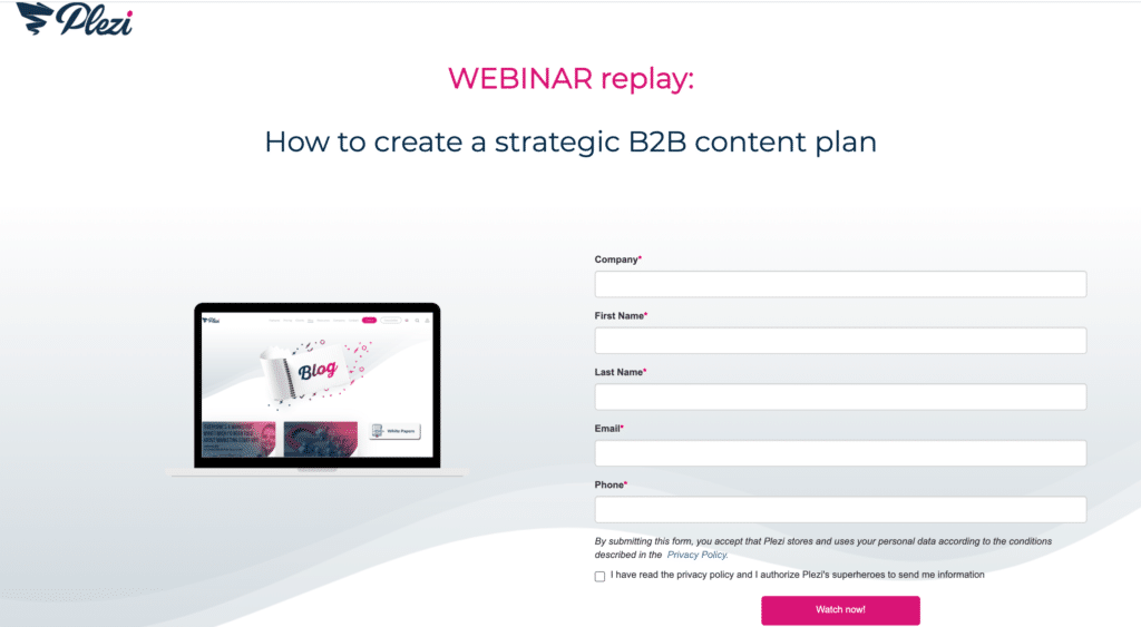
For example, the landing page below doesn’t follow all of the established principles of web usability: we often add very detailed text to better target our customers, you will also find that we prefer to put the form above the fold:
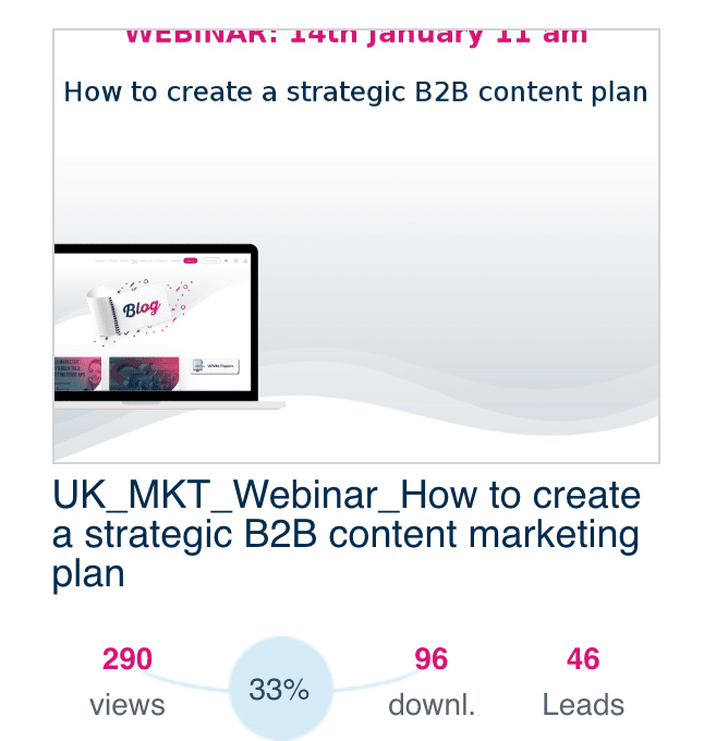
We have a good conversion rate for this page. The secret? We listened to our prospects and speak directly to their concerns. They had shown an interest in the webinar topic and our specific take on it. Above all, it’s your content and value proposition that will make your webinar a success. The landing page is really there to draw attention to it.
2. The best way to create landing pages that really convert
A great landing page must be clear, sound human, and emphasize the value of the webinar it presents. But you don’t have to overdo it, on the contrary! The idea is to make it simple and to work on the things you want to highlight. Your goal is to get visitors to register for the webinar, so all parts of the landing page have to be geared towards that.
You first need to know what audience your webinar is targeting. Before putting together a landing page, you should ask yourself:
- Who is your target audience?
- Is the webinar designed for one or more of your buyer personas? If it targets more than one persona, could it be the subject of 2 different webinars or pieces of content so that their specific needs are addressed?
Targeting webinars to a specific audience is the best way to ensure a good conversion rate. By doing this, you’ll also be able to better suit your language to that particular audience. This will ensure your landing page text and titles have the greatest possible impact.
To ensure that what you write helps meet your goal, it’s a good idea to keep the following questions in mind:
- Is our content useful?
- Is our content as short as possible?
- Is our content clear?
- Does our tone match our content?
If you can answer yes to all of these questions, you’re already on the right track. At Plezi, we always reread what we’ve written with these questions in mind, and find they really help.
After a lot of trial and error on our part, here is what we think is THE list of things to include on a webinar landing page – in the following order.
The title of the webinar
This must be tangible and clearly state what the webinar will offer to prospects. This is the first thing your visitors read, and you should assume that it might be one of the only things. So, the title should be as clear and engaging as possible.
The time and date of the webinar
This information should be immediately visible to prospects. At Plezi, we write the date by indicating the day of the week and the time to make sure that prospects can plan ahead and include our webinar in their already busy schedule.
What the webinar will offer viewers
This short text should provide some basic context and indicate what the benefits are of viewing the webinar.
The idea is not to try and sell something but above all to offer value to your prospects! At Plezi, we like the following format: we start by asking a question to get our prospects’ attention and then explain specifically how the webinar will address this marketing problem.
The webinar agenda
Here, the aim is to inform prospects about what will be covered in the webinar and make them want to register. You can indicate that the webinar will be available to replay, but it’s best to include incentives to join the live webinar. This live interaction is what will offer the most value.
At Plezi, we like to be as specific as possible about the topics we will discuss. What’s more, we often offer other tips and resources that can help our potential audience during the webinar.
The webinar registration form
Registration should be made as easy as possible because it is what asks the most of a prospect. It’s best to limit the required information to a bare minimum and to have no more than 5 fields to complete if you want to avoid losing a few visitors in the process.
With Plezi’s smart forms, these fields will vary depending on what information a prospect has already provided on previous visits to your website. This not only makes it easier for prospects, it also lets you gradually qualify them at the same time!
Secondary information
Finally, you can add things like recommendations, customer testimonials, photos of the speakers, and information about your company.
Depending on your target audience and business context, it will be more important to include some pieces of information than others. Generally speaking, you shouldn’t neglect your webinar’s greatest asset: it’s human element! By including photos of presenters and information about them, you’ll help prospects to anticipate taking part in the webinar.
We also conduct a lot of webinars with different partners, which helps to grow our audience but also get some specialists talking about their area of expertise. Whether on SEO, content strategy, sales, we’ve had a wide range of different partners.
3. A to-do list for creating an effective landing page in just a few minutes
Using Plezi, it’s quick and easy to create an effective webinar landing page. Our collection of landing page templates lets you focus on your content to create a page that delivers results.
Here are the steps you need to carry out to create a webinar landing page that converts prospects with Plezi:
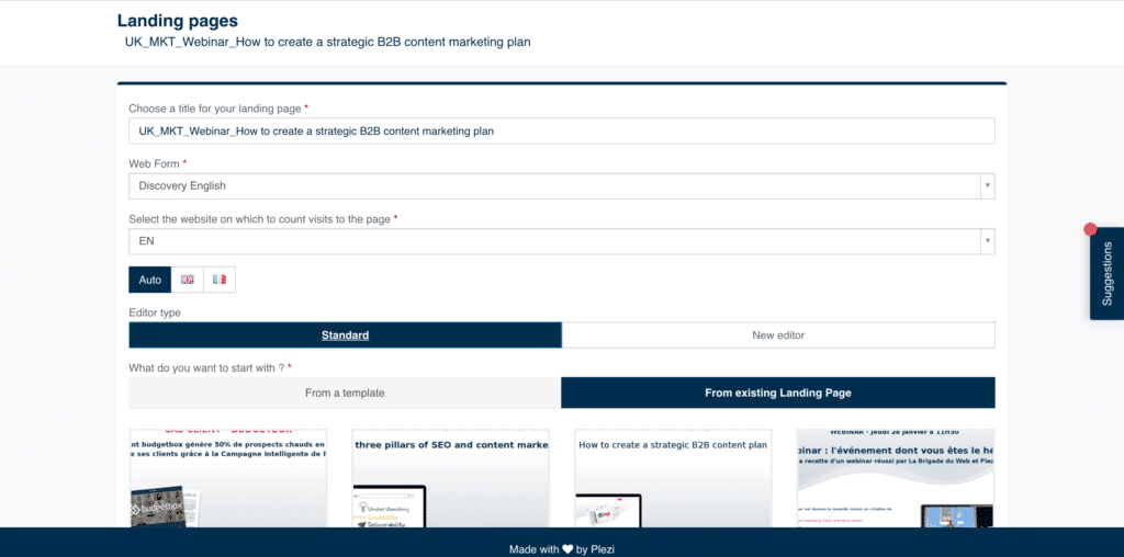
Create the new landing page in the software and add tags;
Select a landing page template;
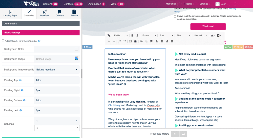
Add your text and images;
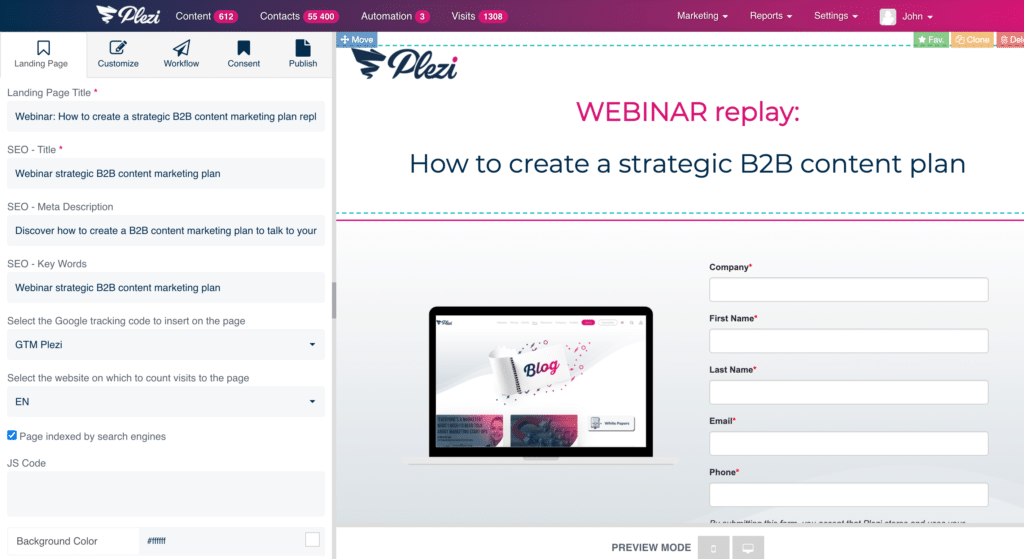
Check that everything is exactly how you want it with the preview;
Add SEO and page tracking information;
Publish it!
When we designed Plezi, we wanted to create a tool that saved marketers time so they could focus on tasks with high added value. The software lets you design landing pages in minutes so you can concentrate on what really matters: creating content and messages.